No matter how long you’ve been working in marketing, there’s always room for improvement. This is as true in email marketing as it is in any other digital marketing discipline.
When you consider that 93% of marketers are using email to distribute content and connect with their target market – and that email is the third most popular source of information for B2B audiences – it’s clear how high the stakes are for getting it right.
Unfortunately, not everyone understands how to create a well-constructed welcome email for new subscribers. So what is a welcome email, and what are the best practices for creating a great one?
What is a Welcome Email?
A welcome email is the first exchange between your business and a new subscriber or potential customer.
As soon as you start interacting with your new subscriber, you need to make sure that the tone of the email is correct, that it connects with your target audience, and that it isn’t too pushy.
You want new subscribers to engage with your business – not be turned off immediately from pursuing a further connection with you.
8 Examples of Welcome Emails You can Copy
1. Chipotle
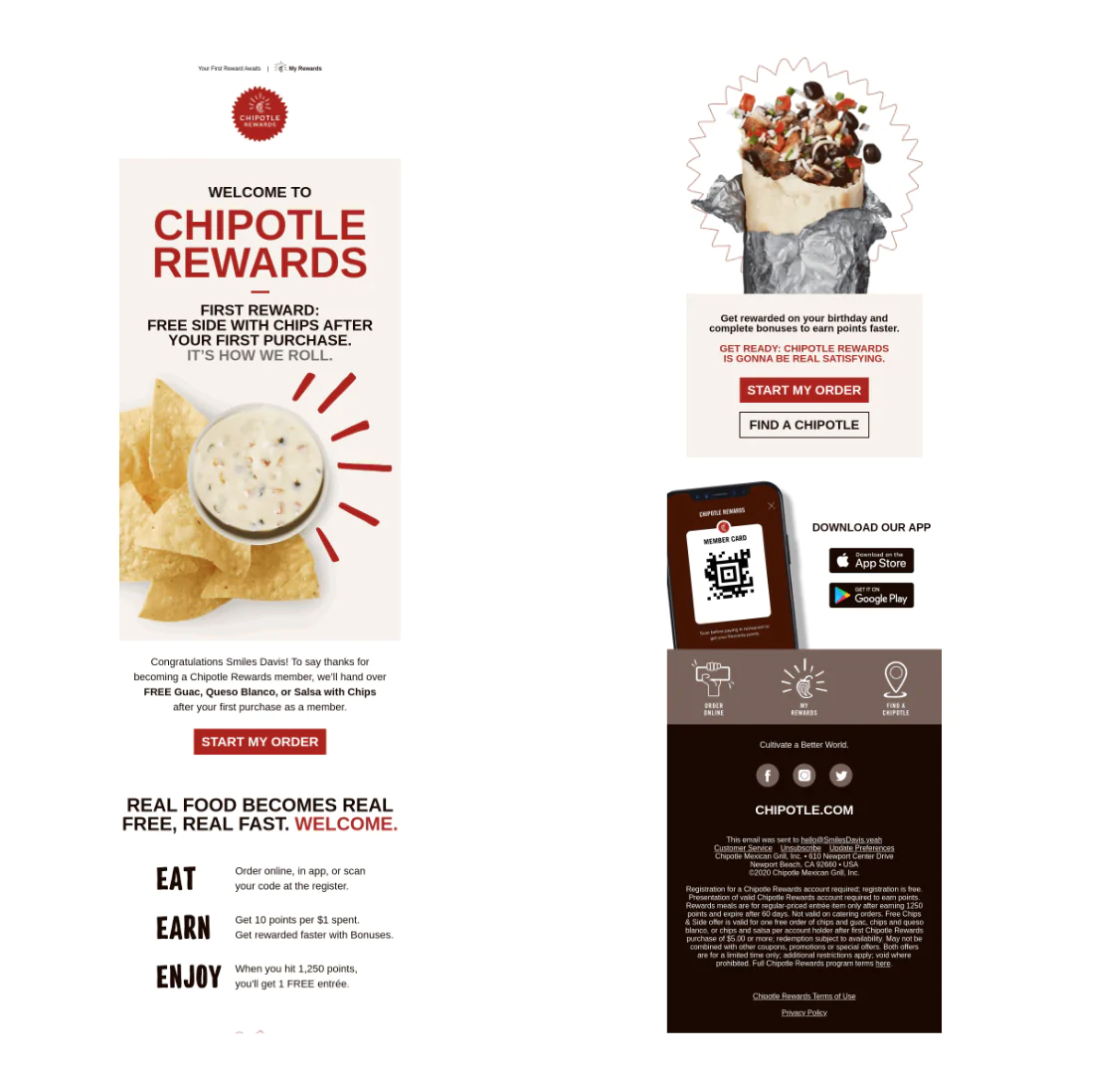
Welcome emails don’t have to come from tech companies. Chipotle provides a great example of a welcome email that a lot of companies can pull from.
Why It Works:
- It displays what they can offer you right away if you’re a great customer
- Call-to-action (CTA) buttons abound throughout the email body
- They use personalization to make each customer feel unique and special
2. Under Armour
Almost everyone has heard of Under Armour, a big competitor to the likes of Adidas and Nike in the sportswear industry. Under Armour does a great job of speaking to their main customer base in this welcome email.
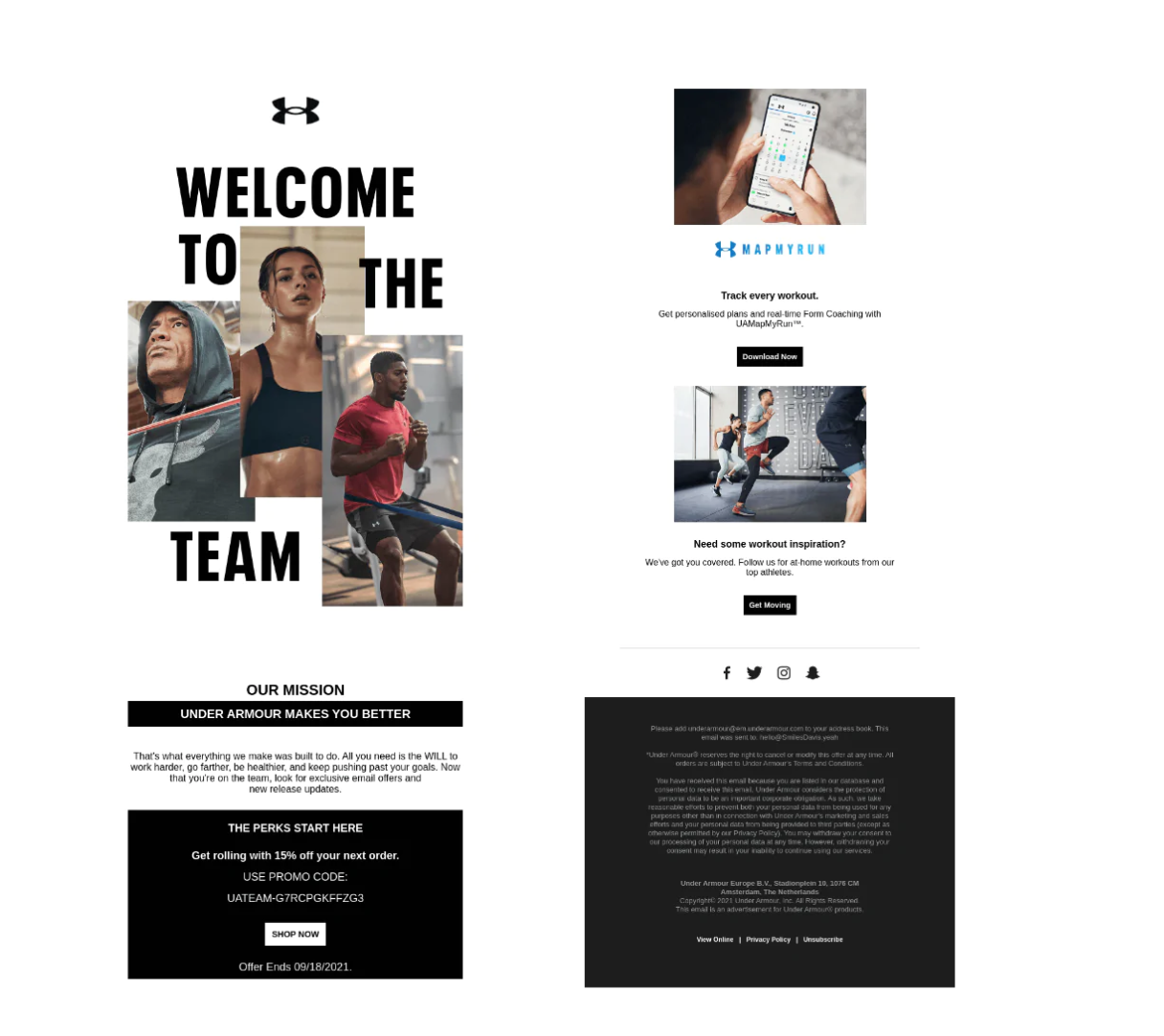
Why It Works:
- The subject line gets attention right off the bat, making customers feel like they’re part of an exclusive club.
- The email itself starts off with a star studded cast to “welcome” you to the team.
- A link to a discount code gets people clicking through to purchase something right away instead of putting it off.
- Sample workout videos go along with the brand, and create additional engagement and value.
3. Urban Outfitters
The clothing store makes a unique approach for their welcome email. They start by welcoming you in, then bring up the benefits of their brand, and finally attempt to get you into their ecosystem with their app.
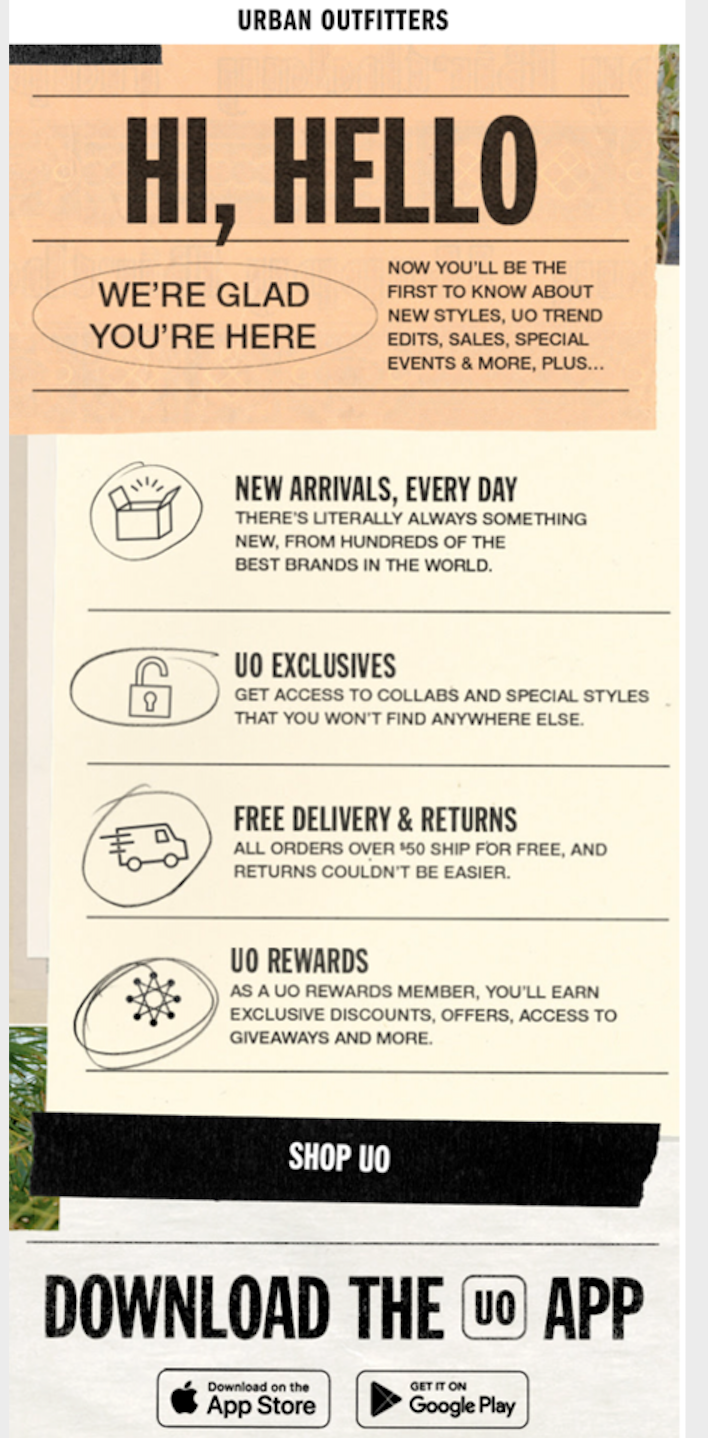
Why It Works:
- They tell you you’ll be the first to know about new deals, and everyone wants to be first.
- A breakdown of the benefits in visually appealing format allows the brand to “sell” without looking like it.
- Cohesiveness is the name of the game with this email. Everything seems “on brand” and it feels like you’re interacting with Urban Outfitters in person, right down to the color scheme.
4. Arctic Fox
Arctic Fox achieves a playful tone while keeping it casual. This helps differentiate it from a sea of other brands in your inbox.
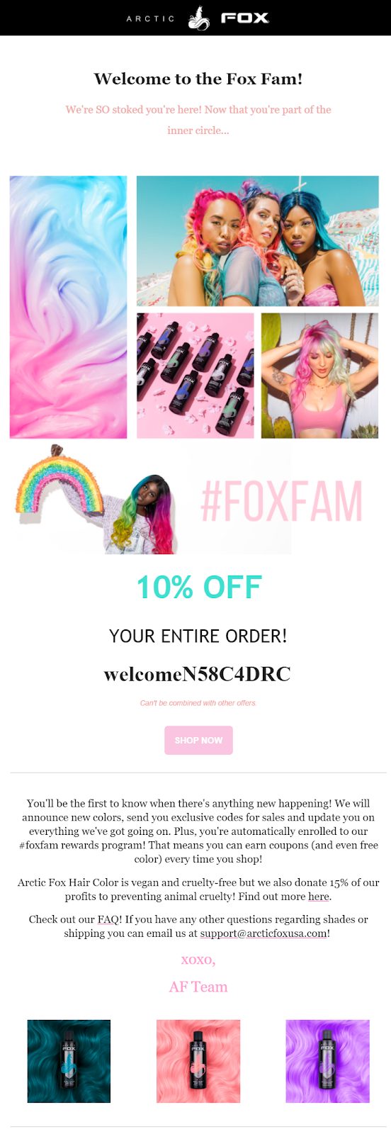
Why It Works:
- Vibrant colors make the brand pop, instantly setting it apart from the mundane emails most users are accustomed to.
- Arctic Fox masterfully lays out a series of CTAs, or next steps, that you can take. That way, you can at least engage with their brand even if you don’t buy now.
- A welcome discount gets people to open their wallets and make that important first transaction.
5. Rifle Paper Co.
Rifle doesn’t try to change the world with its welcome email. It’s a no-nonsense, transparent message that gets customers started on their journey.
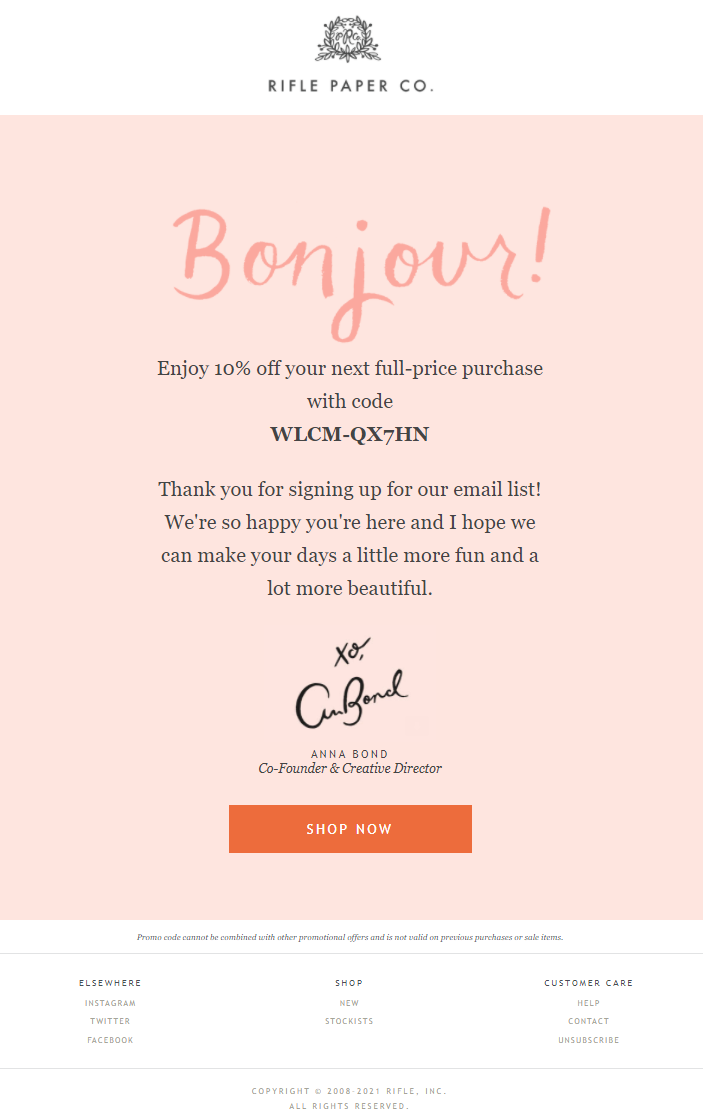
Why It Works:
- A unique opening line in another language makes this email unique.
- Pink, pastel colors help establish the brand identity right away.
- The email is short and sweet. You don’t need to read a dozen paragraphs to get started.
6. Velasca
The Italian fashion brand has a beautiful example of a welcome email that hits all the boxes while looking modern and friendly.

Why It Works:
- An initial discount shows goodwill for their subscribers, encouraging them to become royal customers.
- Storytelling is an art. Velasca doesn’t bore us, but they do touch on their rich family heritage from Italy, which boosts the brand’s perceived value.
- A promise (guarantee) after the offer is a way to build a bridge of trust between them and their market right off the bat.
7. Beardbrand
If you have a beard or mustache to maintain, you’ve likely heard of Beardbrand before. They typically have excellent social media and digital content. This welcome email is no exception.
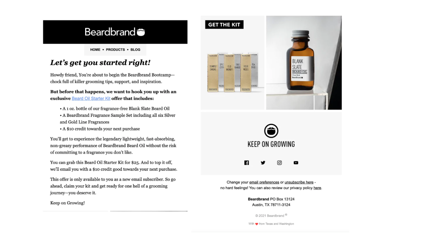
Why It Works:
- A hint of exclusivity makes it feel like you’re getting something special, not just a commodity.
- Just in case you’re not familiar with the brand, you’re able to navigate to other pages of theirs and build trust before making a purchase.
- While there are other potential CTAs, the main goal of leading you to purchase right now is apparent throughout the welcome email.
8. Mint Mobile
Who doesn’t use a mobile service in this day and age? However, mobile service providers like Mint still need to set themselves apart somehow. This welcome email helps them do just that.
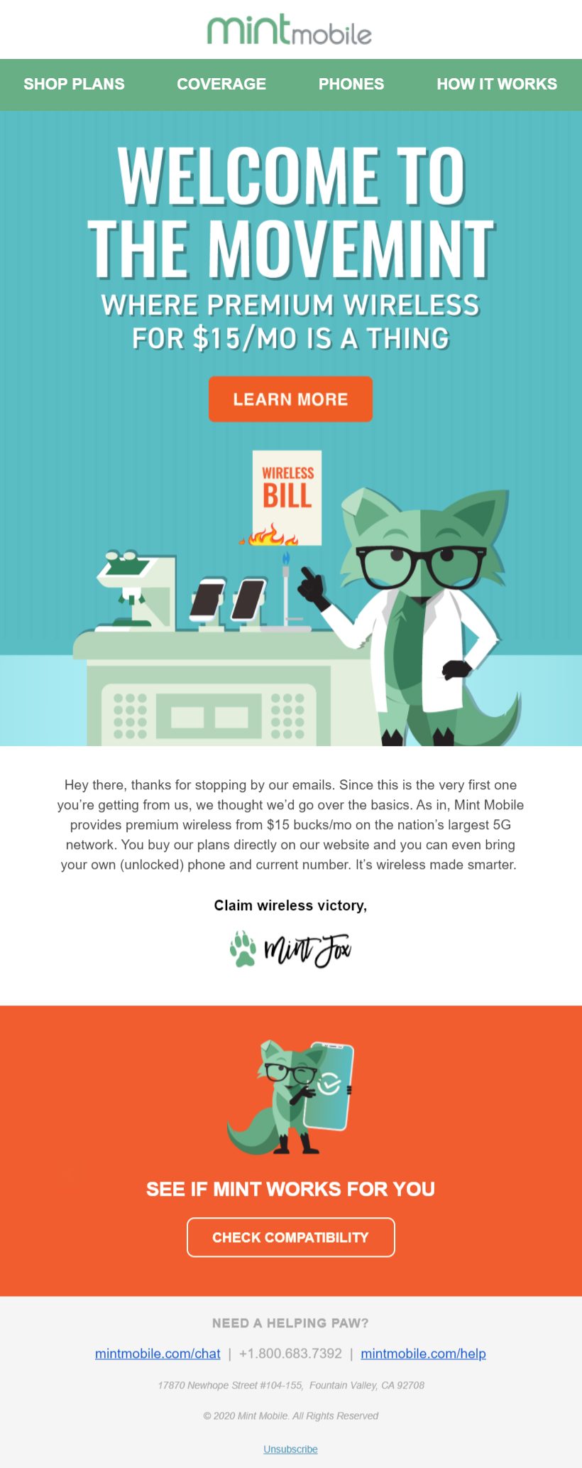
Why It Works:
- They frame Mint as a “movement” — tying your business to a higher purpose helps people identify with your brand from a deeper level and create lasting affinity.
- The welcome email mentions their unique selling proposition (USP) in the second sentence, telling you exactly what you’re getting and for how much.
- There are multiple CTAs, but the main one is to check your compatibility. This soft sell allows the company to qualify customers to save both sides time.
- Informal design choices make this feel less like a transaction, and more like a game.
Welcome Email Best Practices in 2024
1. Work on Your Subject Line
Welcome emails won’t work if new subscribers don’t actually open the message. If your subject line doesn’t make people want to open the email, you’ve failed this first hurdle.
First impressions count.
Always be testing new subject lines. Learn from your successes and failures, and continue to tailor your subject line message over time based on the data you’ve gathered.
2. Always Say Thank You
It may sound obvious, but you’d be surprised how many welcome emails don’t actually convey the message that you’re thankful for the new contact.
They’ve chosen to engage with your business, so show your appreciation. Good manners cost you nothing.
3. Deliver on Your Promise
Did you give your new subscriber an incentive to sign up? Did you promise prospects that you’d respond in a set period of time? If so, you need to deliver on that promise. If you offer a free download or a discount, that messaging needs to at the top of your email.
Nothing breaks trust faster than not delivering what you’ve promised.
4. Focus on Benefits
Your new subscriber isn’t as clued into your business or your brand as you are. You may think the benefits of your product or service are apparent. But they probably aren’t as obvious to your new subscriber.
List them out for clarity’s sake.
Lay them out in bullet points so that new contacts can take them in quickly. Email newsletter recipients often scan, rather than read in-depth. Make it easy for them to do so and still walk away with the knowledge you need to share.
5. Let People Know How Many Emails to Expect
One of the biggest reasons people unsubscribe from email newsletters is because they receive too many messages.
Once you discover that email works for your business, it can be easy to go overboard. Let your new subscribers know how many emails they might expect over a month, as well as what they are likely to find in each newsletter.
If your new subscriber knows what to expect – and how often they can expect it – they’ll be less likely to unsubscribe.

6. Invest in Good Design
Good design sells.
Period.
Sloppy or bad design sends the wrong signal to your new subscriber. Good email design helps convey trustworthiness and experience.
Thanks to the many design tools available today, not being able to afford a professional designer is no longer an excuse for bad design. Tap into these resources, and ask people you trust to review your designs and see what messages they convey.
7. Invest in Strong Images
Design is essential – and the images that you choose are just as important. Showcase your products, and show new contacts what you offer.
Remember, new contacts wanted to know more about your business or product. That’s why they contacted you or subscribed to your newsletter. So show them (just please, please, never resort to using stock photography to do so).
8. Provide a Whitelisting Option
Its best practice to include a whitelisting option in your welcome email. After all, you don’t want your hard work getting stuck in your new subscriber’s junk filter.
Often, whitelisting requests are included an email’s pre-header by asking new subscribers to add you to their “safe senders list.” Be direct. Don’t let unclear messaging prevent you from hitting the inbox.
9. Create a Strong Call to Action
What is that you want your new subscriber or contact to do? Whatever that is, make it extra obvious what they should do next.
Since people tend to scan messages, they might miss subtle CTAs. Instead, make your request stand out, but keep it reasonable. Show value. Give them something for free. Demonstrate that you can help them or address their pain points in order to build the groundwork for your future relationship.
10. Include All of Your Contact Details
Sounds obvious, right?
You’d be surprised how many welcome emails don’t have this essential information included.
Try to include:
- A link to your website
- Your email address
- A phone number (if applicable) – some people will still prefer to contact you via phone
- Links to the social profiles – Twitter, YouTube, Instagram, Facebook, etc. – where you’re most active. You may even want to encourage them to follow you on these channels.
Remember, one goal of your welcome email should be to keep contacts coming back for more. Don’t leave them with unanswered questions, but don’t overwhelm them either.
It’s the job of the welcome email to encourage ongoing connections with your brand. Not every new contact is going to become a new customer, but a well-crafted welcome message can increase the percentage that goes on to do business with you. Keep these best practices in mind, and you’ll be well on your way to creating ongoing relationships that last well into the future.
Track emails, email reminders & templates in Gmail for free
Upgrade Gmail with the features it’s missing
Add to GmailDavid Campbell
David Campbell is the editor of the Right Inbox blog. He is passionate about email productivity and getting more done in less time.
