In today’s digital age, emails have become an integral part of professional communication. Whether it’s reaching out to potential clients, establishing connections with industry peers, or attracting new customers with email marketing campaigns, email etiquette plays a crucial role in leaving a lasting impression.
While the body of an email receives the most attention, we often overlook the significance of the email footer. This seemingly minor element has the potential to reinforce your professionalism, enhance your branding, increase trustworthiness, and create a cohesive experience for recipients.
In this guide, learn more about what email footers are, elements to include in your email footer, and check out helpful examples to inspire your own.
What Are Email Footers?
An email footer is the space of text located at the very bottom of an email, after the body copy and main contents. It typically contains information about the sender, including:
- Name or business name
- Job title (for personal emails)
- Address
- Phone number
It can also contain brief marketing messages or legal disclaimers. Email footers can be set up manually within an email platform by adding the desired text and formatting at the end of each email.
Alternatively, they can be automated using email signature management tools, which allow users to create and manage consistent signatures across an organization. Customizing your email footers is a great way to test what your recipients respond to the most in email marketing campaigns. It can also be an efficient way to increase sales prospecting success.
Elements To Include in Your Email Footer
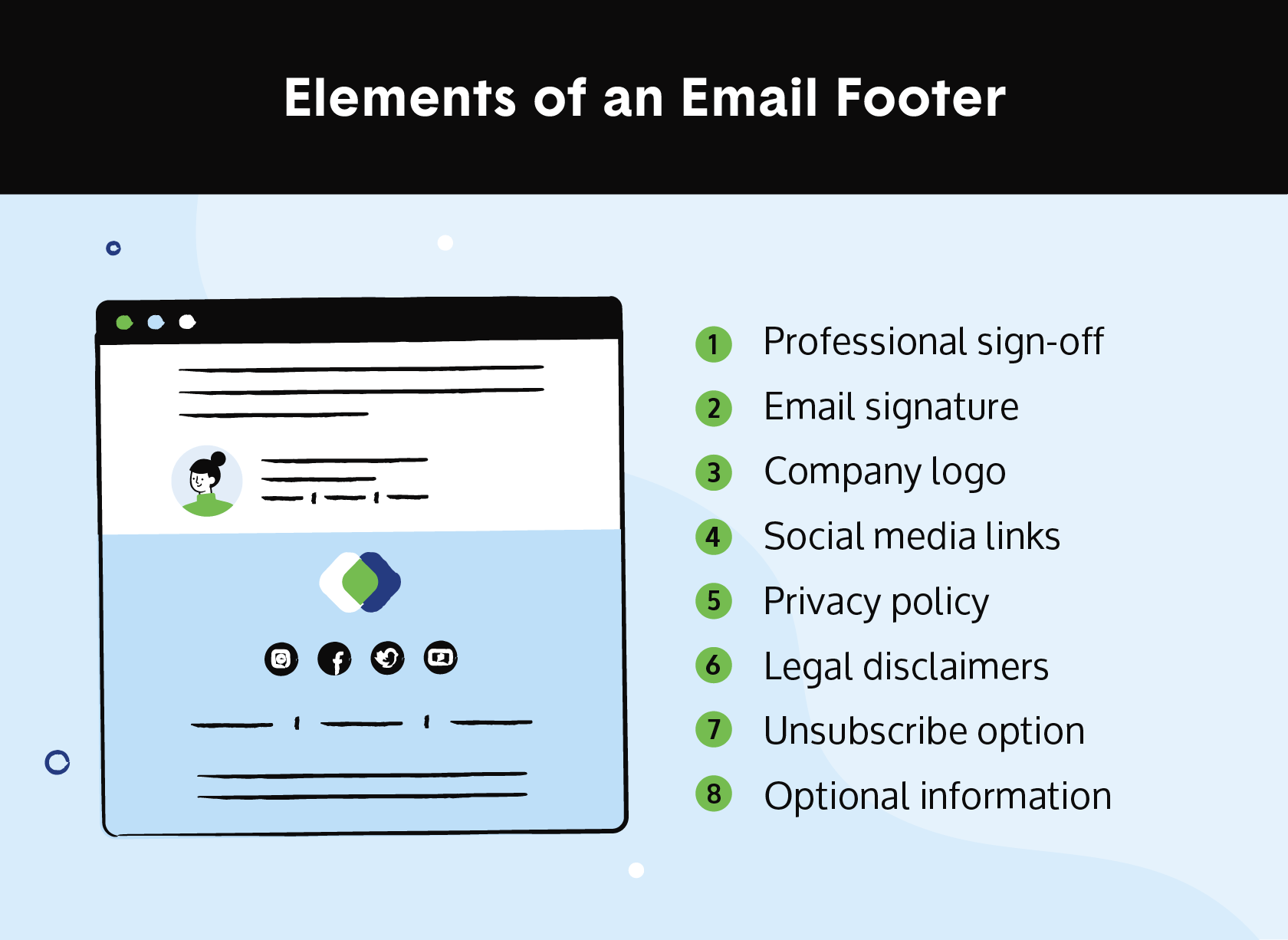
An email footer serves various purposes, such as providing contact details, legal disclaimers, and professional branding. Here are some common elements to include in an email footer:
- Professional sign-off: At the end of each personal email, it’s a good idea to include a professional sign-off to conclude the contents of the email.
- Email signature: Include your full name, job title, company name, address, phone number, and website.
- Social media links: Add links to your social media profiles if you have them, including Twitter, Instagram, Facebook, or LinkedIn, to help connect with other professionals.
- Company logo: By including your company logo in your email footer, you can help reinforce your brand and professionalism.
- Privacy policy: If it applies, you can add a privacy policy to your footer to assure recipients of how you handle their personal information.
- Legal disclaimers: Depending on your location and industry, you might need to include legal disclaimers, such as confidentiality statements, copyright notices, or disclaimers about the content of the email.
- Unsubscribe option: If you send marketing or promotional emails, include an unsubscribe link to give recipients the option to opt out of future communications. (It’s required by law!)
- Optional information: You may include additional information such as your job role or department, office hours, upcoming events, or a brief personal bio for an added touch.
13 Email Footer Examples and Best Practices
Below are 13 email footer examples in action and best practices to keep in mind while getting started on your own. Remember that these examples are just starting points — be sure to customize and combine elements to create a unique email footer that aligns with your brand and communication style.
1. Simplicity Is Key
While it’s important to provide helpful details and information in your footer, it’s equally important to stick to a simple layout and design. Stay true to your branding, but include only the most important info and make the text as scannable as possible for the reader.
For example, Gorjana executes a sleek and scannable design in its email footer:
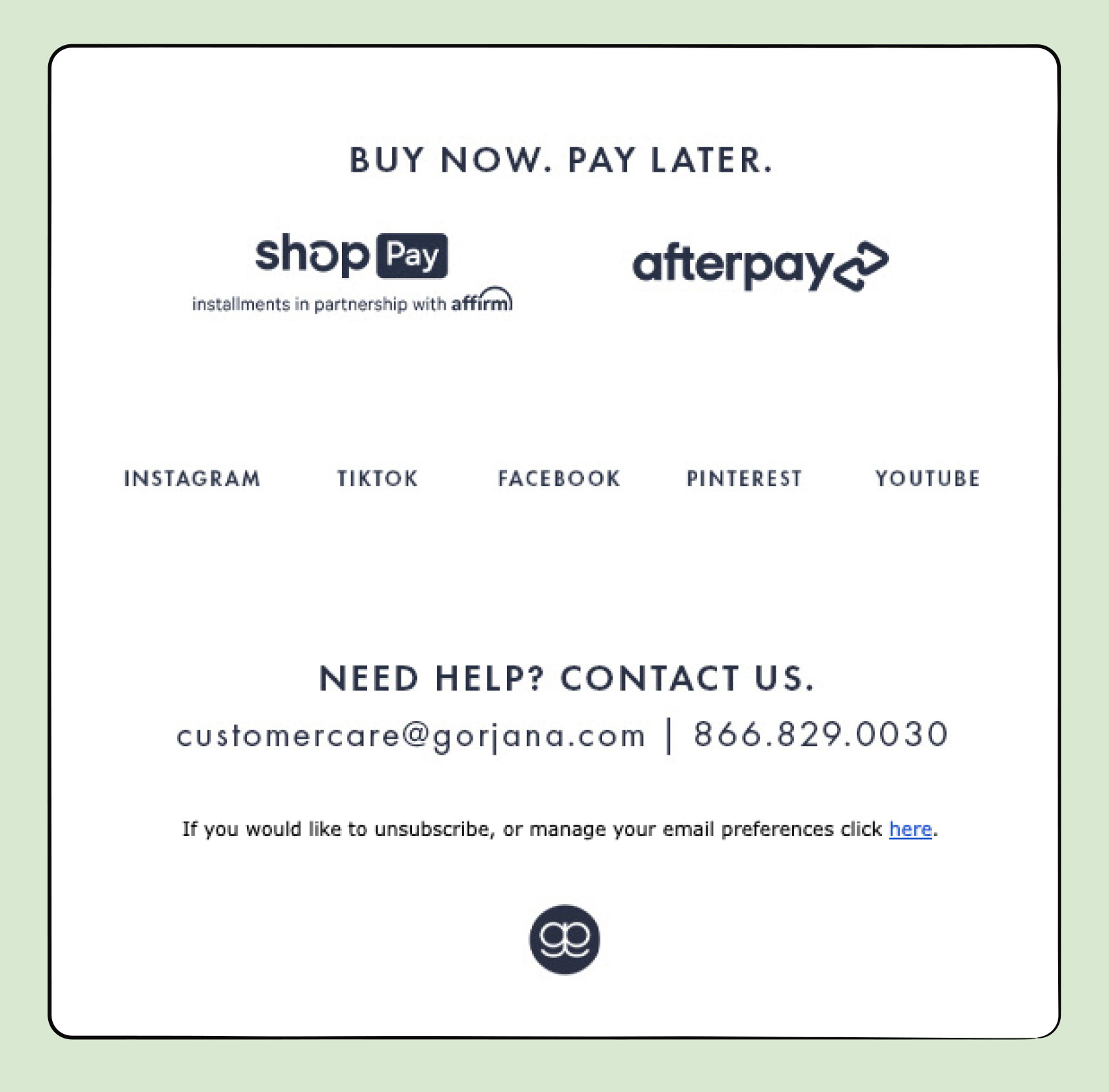
This email footer example has a clean look, it’s easy to read, and the text is spaced out so that it’s not too cluttered within the space.
2. Include an Option To Unsubscribe
Give recipients the choice of unsubscribing to email communications or a link to change email preferences. This will allow recipients to no longer receive your emails or change the type or frequency of the emails they receive. This component is also required under the CAN-SPAM Act and other consumer rights laws.
A good example of this is shown in the email footer from Intuit Credit Karma:
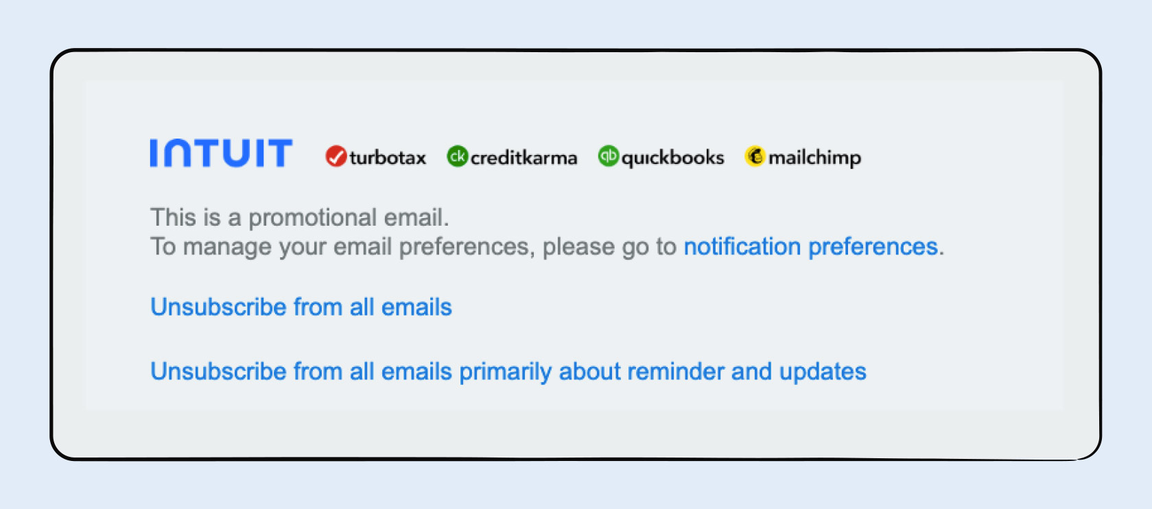
The business very clearly gives the user the option to unsubscribe to all emails, plus the additional option to unsubscribe from specific updates and reminders.
3. Tell Readers What They Signed Up For
Be sure to include what exactly the email receiver signed up for and why they’re receiving emails. This reminder helps them understand why they may be interested in the emails and can help reduce the risk of getting reported as spam.
For example, Spotify clearly states this in its email footer:
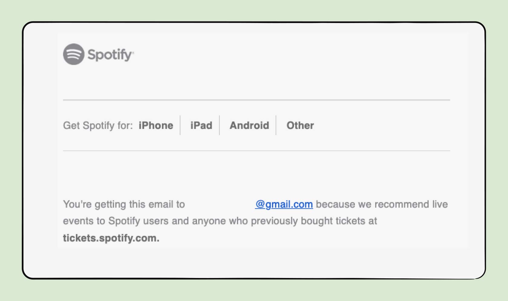
Spotify sent the email because the recipient had previously ordered tickets from the website and may be interested in live events.
4. Include Information About Restrictions
If you include offers in your email, it’s a good idea to include any restrictions or additional details about the offer in your email footer. This helps promote transparency and gives the recipient more information about what to expect.
With this email footer example from Alaska Airlines, recipients are informed about specific details and restrictions that apply to the offer included in the body of the email:
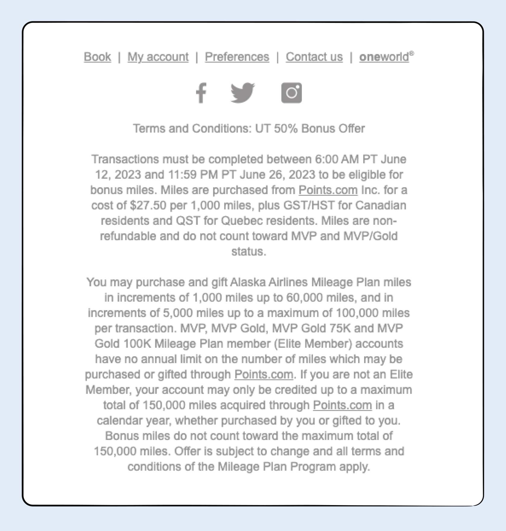
Terms and conditions give the recipient as much information as possible about the offer and can help protect the business by making sure everyone who participates in the offer follows the rules.
5. Add a Security Disclaimer
If your business deals with sensitive information, you should add a security disclaimer to your email footer to let recipients know that their information is confidential and will not be shared.
With Airbnb’s secure payment disclosure stated in its email footer, the recipient can rest assured that their payment information is protected.
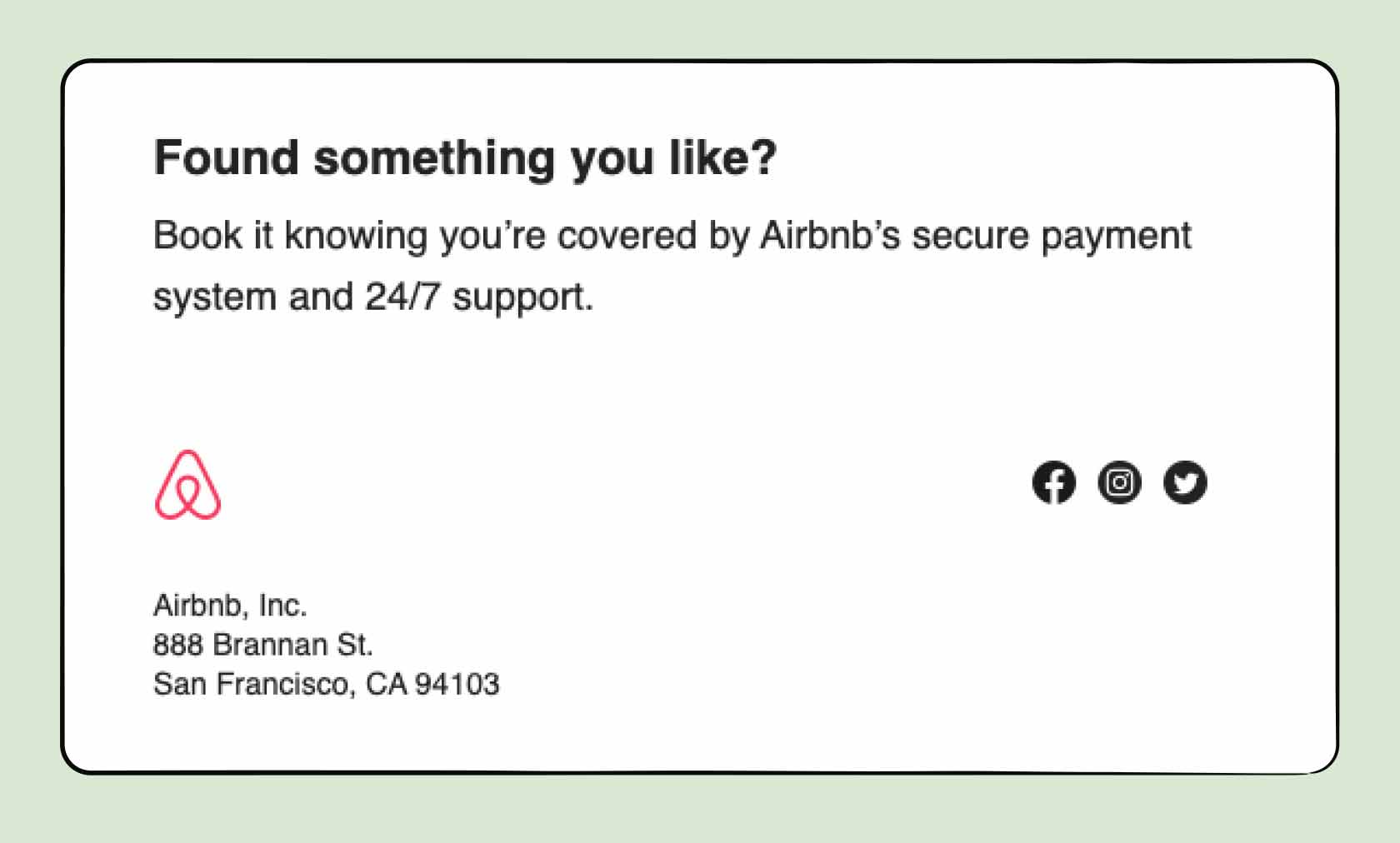
These disclaimers can protect your business from any legal claims, whether they’re from the recipient or a third party. It can also instill trust with the recipient since they’ll feel like their protection is important to your business.
6. Make Your Emails Mobile-Friendly
Ensure your email footer is responsive and displays correctly on mobile devices. Many people read emails on their smartphones, so it’s important to create a seamless experience across different screen sizes. This may also help your emails stand out, considering only 20% of emails are optimized for mobile.
To make a mobile-friendly email footer, consider these optimization tips:
- Minimize too much spacing
- Avoid images that are too wide and reduce their size
- Use a larger font size
- Include touch-friendly buttons
- Use a single-column layout
- Try out an email signature tool
Here’s an example of a mobile-friendly email footer from Grubhub:
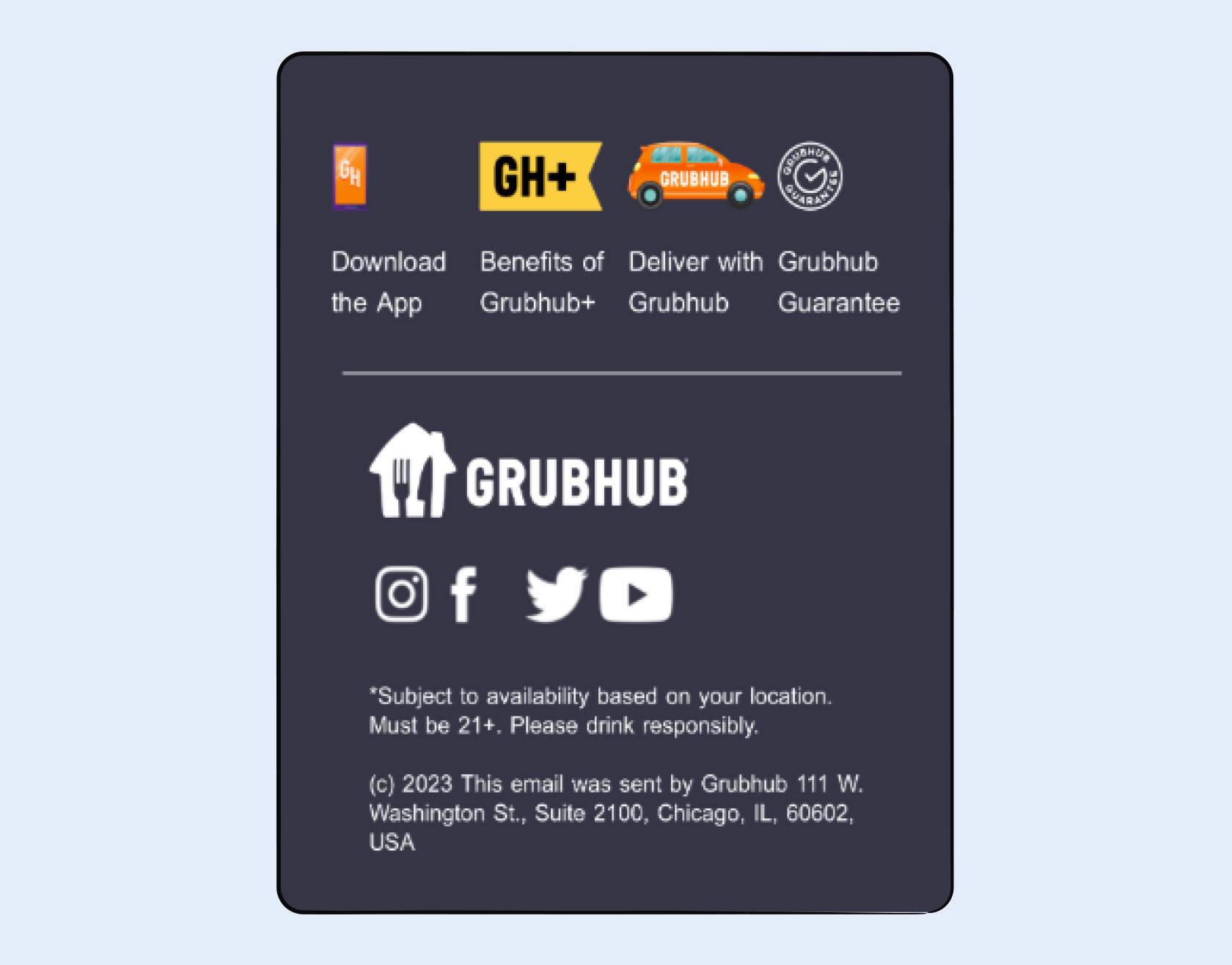
Grubhub uses a larger font size, includes clickable buttons, and maintains consistent spacing.
7. Use Consistent Branding
To maintain a clear brand identity, it’s crucial to use consistent branding and messaging in any form of marketing you do for your business, and that includes your email footers. Consistent branding means maintaining a similar feel and look throughout your:
- Colors
- Font types
- Messaging
- Imagery
A business that uses consistent branding in its email footer is Whole Foods:
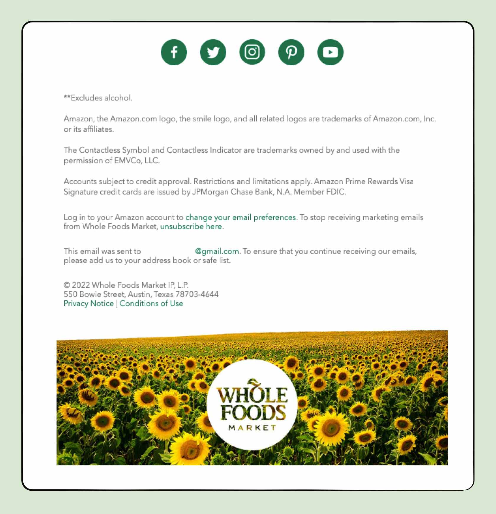
The email footer sticks to the same font, keeps the same green color throughout the hyperlinks and social media buttons, and includes imagery at the bottom that resonates with the brand.
8. State Company Values and Mission
Including your mission statement within your email footer can help remind recipients of your business’s values. By briefly stating what your company stands for, you can build a stronger connection with your target audience and stand out from competitors.
United By Blue weaves its company values and mission into the email footer:
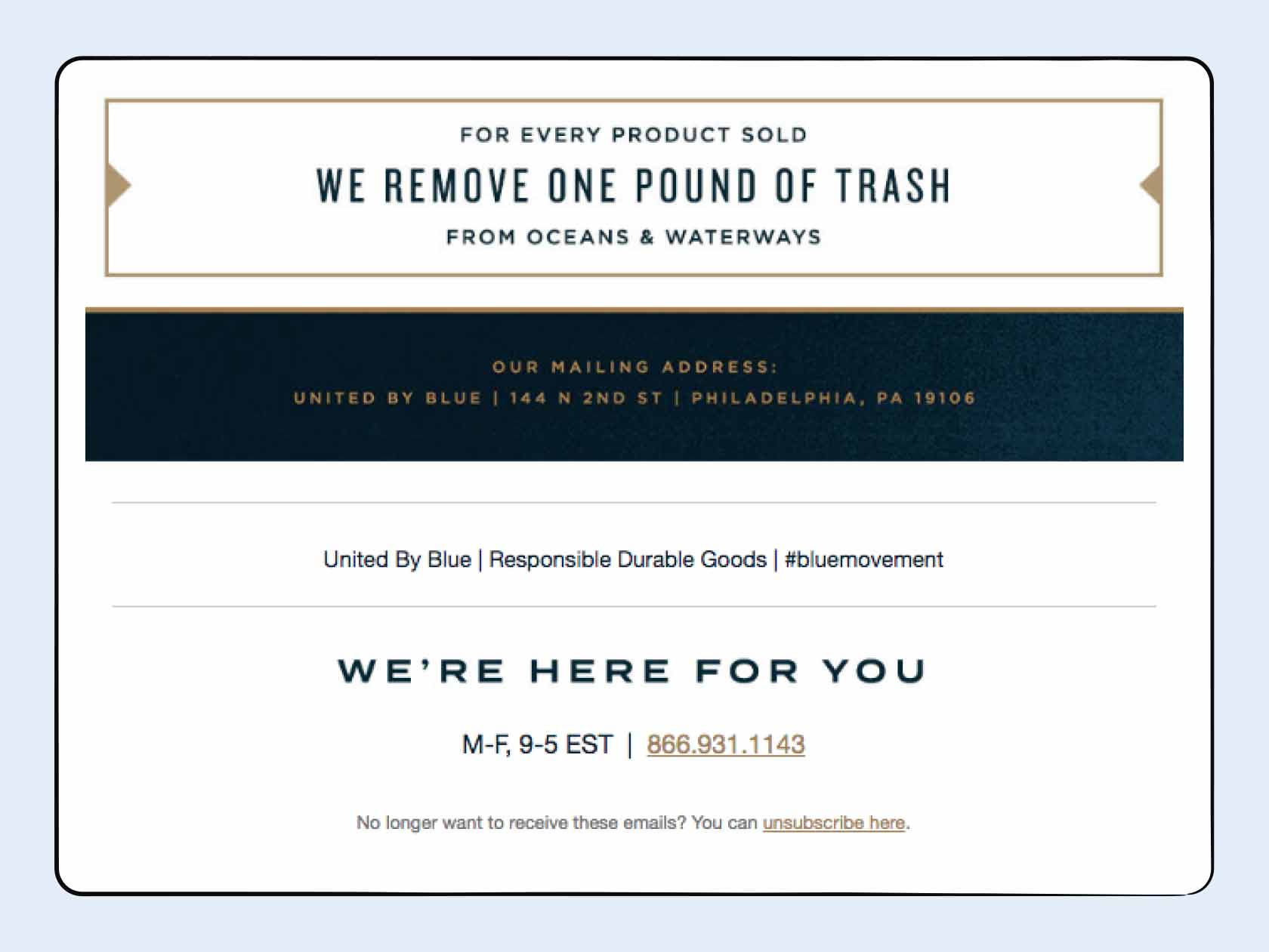
United By Blue is a sustainable brand that uses ethically sourced materials. By stating that every purchase helps clean the oceans, it can potentially increase buy-in from eco-conscious customers.
9. Leverage a CTA Button
A call to action (CTA) is a clickable element that directs users to the next step in their journey or prompts them to take action. For example, you could add a link to a new product, a button that directs readers to schedule a meeting or appointment, or a resource page that encourages readers to learn more.
Tripadvisor integrates a simple CTA button for its help center:

Doing this within your email footer will not only be helpful to readers, but can direct them to important content on your business’s website that could contain links to services and products — potentially increasing sales.
10. Add Social Media Links
To further expand your audience and allow email recipients to connect with you and your business, be sure to include social media icons in your email footer. Choose three to five platforms that are the most relevant to your business.
For example, if you’re an online retailer, you may want to include a link to your Instagram page rather than a LinkedIn profile, which is more geared toward personal and professional connections.
FabFitFun places social media links at the top of its email footer to grab recipients’ attention:
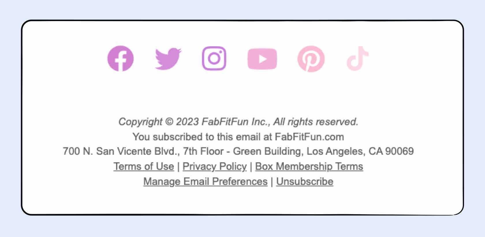
It also includes a wide range of options for the recipient to choose from, including Facebook, Twitter, Instagram, YouTube, Pinterest, and TikTok. Having a wide range of social media options available for the recipient can make it easier for them to reach out to you depending on which platform they use the most.
11. Integrate a Survey
Consider adding a survey to your email footer — this can be an easy opportunity for you to get feedback on your email campaign, your products, or your business as a whole.
Rocket Money is able to survey its audience and gather some insights along the way with a simple, quick survey feature located at the top of the email footer:
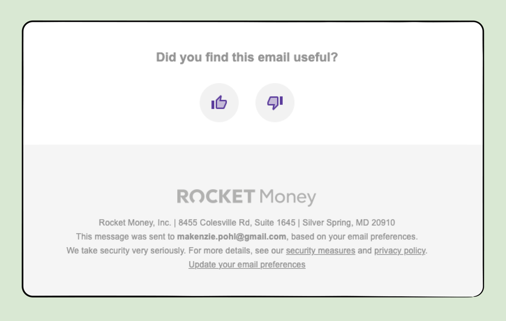
It’s important to keep these as simple as possible so the email footer stays uncluttered and the recipient doesn’t have to go through more than one step.
12. Utilize Referrals
To generate new customers, consider adding a referral incentive to your email footer. If the recipient refers someone they know to your business, you can reward them with a prize or discount. Implementing this strategy can also be an easy way to increase customer loyalty.
Scentbird gives its customers a free fragrance for referring friends:
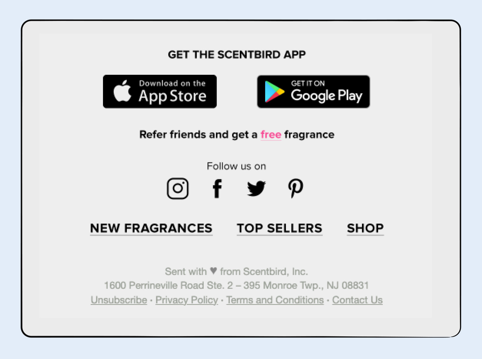
This example highlights how to accomplish two goals at once: expanding your audience and building loyalty.
13. Add Personal Touches
Adding email footer personalization can make your emails more approachable and help you connect with your recipients. You might include a short bio about yourself, a personal fun fact or quote, or a professional tagline to help you stand out.
This email footer example from The Farmer’s Dog does it well:
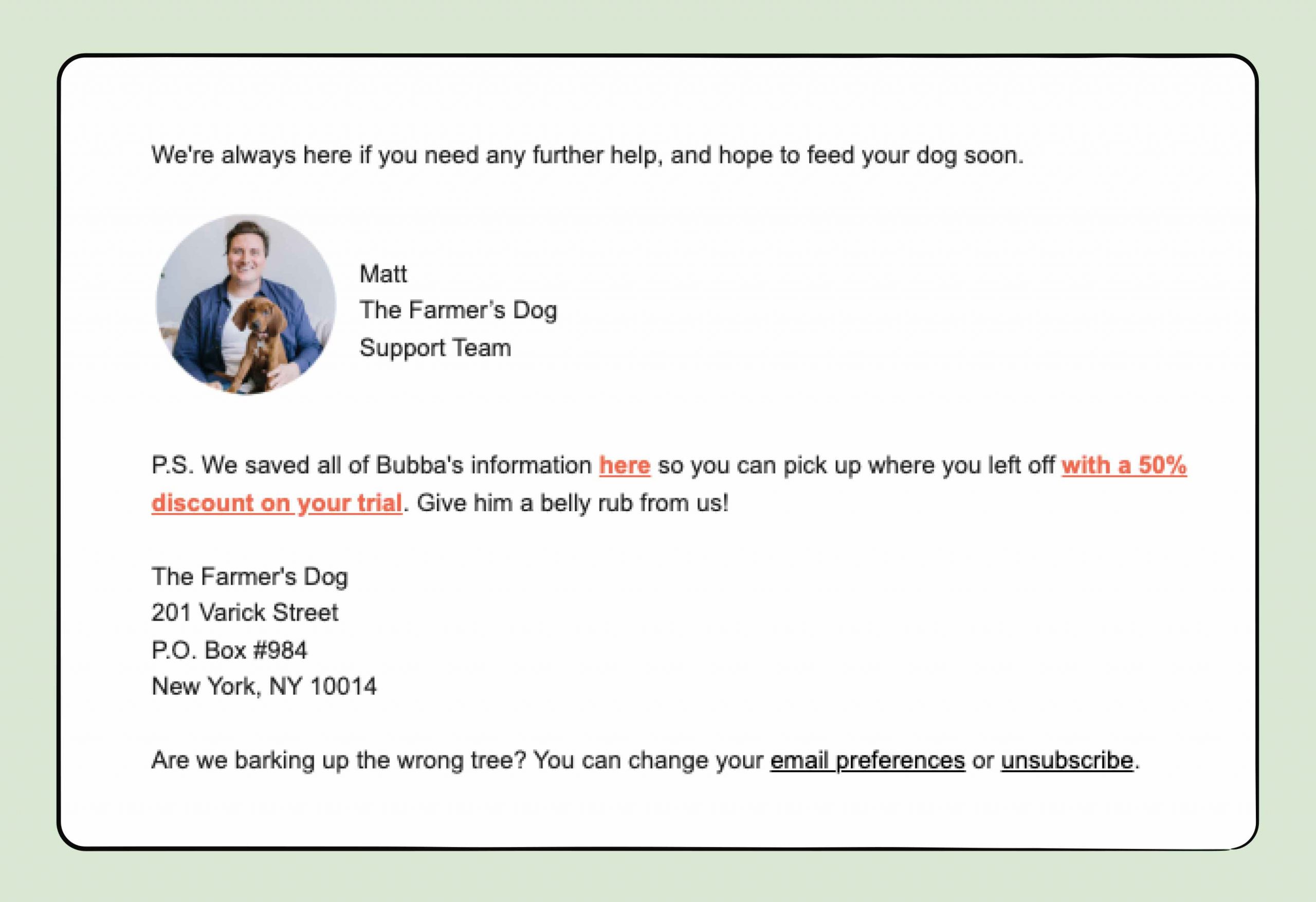
The business includes a personal sign-off and message from a member of the team, as well as creative text for the unsubscribe option.
Leverage Email Footers for a Successful Campaign
With these email footer examples, best practices, and tips, you’ll be well on your way to creating a high-performing email marketing campaign. Be sure to get started with a Gmail email template to streamline the process.
And by using email tracking for Gmail, you can see who’s opened and clicked on your email links, so you can reach the right audience at the right time.
Track emails, email reminders & templates in Gmail for free
Upgrade Gmail with the features it’s missing
Add to GmailDavid Campbell
David Campbell is the editor of the Right Inbox blog. He is passionate about email productivity and getting more done in less time.
