As another year arrives, new email design trends emerge to inform your email templates. While certain trends from the past year are expected to continue, we’re also seeing greater opportunities for brands to get creative and inspire visitors to connect with them in new ways.
However, with the number of emails and newsletters being sent worldwide increasing, it will require originality to stand out from the crowd.
In this article, you’ll discover how brands are developing their email marketing strategies by creating templates designed with new email trends in mind in mind. Popular styles like minimalism, dark mode, bold colors and typography, and effective use of white space, can help you grow your subscribers, build customer loyalty, and increase click-through rates for your email newsletters in 2024 and beyond.
1. Minimal Templates
With the average attention span being shorter than ever, we’ve witnessed an increase in minimalist, basic, and sleek email template designs, particularly in transactional email.
Minimalism is about avoiding the unnecessary, and focusing on what matters most. You should be aiming to make it easy for your scrolling through your content, and find clear, meaningful information whether it’s about a specific offer, event, blog post, or other highlights.
Think about white space, monochromatic color schemes, and limited use of fonts to keep your emails template designs fuss-free and easy to consume – and make your call to action obvious.
2. Dark Mode
This email design trend consists of a reversed color scheme that uses light-colored typography, and iconography on dark backgrounds. Dark mode is a design trend that’s been on the rise for some time now— and for good reason. Several of the benefits of using dark mode in your email campaigns include:
- It’s easier on the eyes, as light text on a dark background reduces eye strain significantly, especially in low-light settings.
- It shifts an interface’s color palette to display content in high contrast using dark background colors and light foreground, boosting content readability and making it easier for some users to consume content on gmail desktop app and mobile devices.
- And finally, it dims the screen’s brightness, helping to extend battery life of whatever device is being used to view the content.
With most email clients such as Gmail using dark mode, marketers can get creative and produce separate email templates for light and dark mode.
3. Interactive GIFS
Animated GIFS offers a fun, attention-grabbing way to introduce your key message, product update, or latest campaign to email subscribers. On top of this, there’s a reason why savvy brands enjoy animated emails; it’s been proven repeatedly that when combined with the right message and tone, animated emails can increase conversions.
Many brands are using GIFs to increase engagement with their target audience via their emails. This design trend can help you send emails that are quirky, creative, and packed full of personality, and GIFs are compatible with most browsers and devices, so users will be able to view them whether they’re on a smartphone, tablet, or PC.
4. Soft Gradients
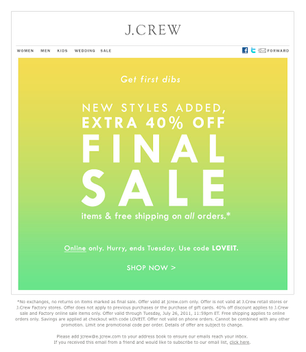
Gradients, also described as color transitions, are a progressive blending from one color to another. We’ve witnessed this trend grow steadily over 2022 and in 2023, and it’s here to stay.
Gradients don’t have to be in bright colors. Softly blended shades, particularly pastels, combined with a gentle background can instantly generate a calming aesthetic for email design, helping to put viewers in a relaxed mood and ready to consume.
Source: J.Crew
This is the reason why more brands are opting to use gradients. They can add interest to a design, whether used as a background within an image or photograph, or as part of a call to action (CTA) button.
5. Bold Typography
Bold typography is going to be big in 2024 across many areas of design, but why is it having such an impact on email design? Because, it offers designers and marketers alike yet another opportunity to capture a reader’s interest, make a dramatic statement, and quickly deliver the content that matters most.
Big, bold headlines are quickly becoming the norm in email design, frequently taking the spotlight away from images or other graphics. Partly inspired by the playfulness of social media graphics, emails that employ big, bold typography typically let the message do the talking.
Although at first using bold typography may seem a little overwhelming, if you ensure that you select the correct font, maximize your use of white space, balance it out with the right color palette, and have clear blocks that define the different content, this trend can have a big impact.
6. 3D Images
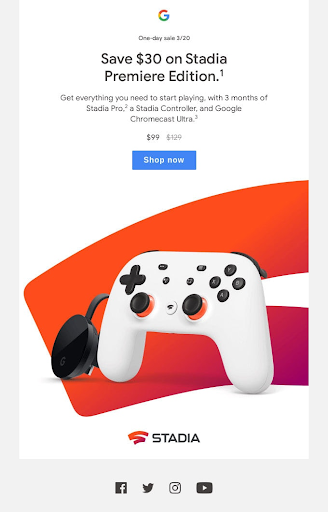
A 3D image is an imaging technique whereby you create the illusion of depth within an image that is actually 2D in dimension. We’ve recently noticed an increase in brands adopting 3D techniques such as photorealism, 3D and isometric graphics, and smart shadow applications in their email designs.
Source: Google
Since a single 3D image can provide a lot of context on an object or person, brands are opting for photorealistic images to showcase their products. Outside of a video–or being able to see, feel and touch a product in real-life 3D images give the viewer a glimpse of what the item is physically like. If you’re going to use 3D images in your emails, make sure to choose a subject with depth, keep it in the center of the frame, and take more images than you need so you can select the best two in editing.
7. Custom Illustrations
Now, more than ever, customers crave authenticity in their interactions with brands. Bespoke illustrations –particularly when they seem hand-drawn, personal, and capture emotions and feelings, enable brands to demonstrate a more playful and human side. An illustration is an effective storytelling tool; it can help to demonstrate products in action and convey conceptual messages in a simplified way.
Research shows that when images are relevant and meaningful, audiences are more willing to engage with them. It’s one thing to level up your subject lines to boost your email open rate, but if your content isn’t compelling– or it’s packed full of generic imagery–subscribers will switch off (or worse still, unsubscribe) quite quickly.
Because email is primarily used to establish direct relationships, build customer loyalty and personal connections between a brand and its target audience, it’s no wonder that custom illustrations are being used to enhance email content.
Some of the key trends to watch out for in illustration this year include 90s nostalgia, daydreamy doodles, line art, minimalist illustration and one of our favorites, odd bodies, which celebrates diversity in design.
8. Video
With attention at an all-time low, video can be one way to stand out. You can show your product or service solving the market’s problem in real time. This can have an emotional impact.
When 92% of marketers report a good ROI on video content, there must be something to it. And you can simply repurpose existing content without reinventing the wheel. Some email software doesn’t play video, so be sure to have a clickable link for those providers.
9. Personalization
Customizing your emails can help you express the right message to the right segment of your list. For instance, some people may be more interested in how you can save them time. Others might be more price-conscious.
Personalization allows you to identify unique characteristics like location, behavior, and buying history. From there, you can send different versions of emails and media. Ultimately, you can increase conversions by matching the message to the market.
10. Accessibility
Equal access is important in 2024 and beyond. You want your emails to be accessible for users who may have visual or physical disabilities. This also helps ensure that your email marketing is WCAG 2.0 compliant.
So look at your HTML, images, and alt-text to ensure any potential customers can consume your messages without issues.
Embracing 2024 Email Design Trends
In 2024, the email marketing landscape will continue to evolve, with more brands focusing on personalized emails, responsive email design, creative visuals, interactivity, and minimalism.
Subscribers want genuine brand engagement, and every email represents the opportunity to provide a unique and personal experience. Every element is important: from the colors and graphics to the content’s layout–it all becomes an essential part of telling a brand’s story.
To meet these demands, brands should remember that email design trends change and develop, in line with users’ tastes and preferences. What worked yesterday may not work today, and tracking trends will allow you to keep up with the current shifts in email design and email marketing.
****This is a guest post from Lily López. Lily is a Content Writer and Marketer at Envato by day, and a Spatial Design student by night. She’s based in Tijuana, Mexico and has worked with several global clients for the past 7 years. ****
Track emails, email reminders & templates in Gmail for free
Upgrade Gmail with the features it’s missing
Add to Gmail